


Risk engine — Decision view
2026
|
Lead Product Designer
D2C, B2B2C, Customer care, Risk management
The Risk engine is a key part of the bank’s decision-making system and is used by the back office. It looks at over 100 parameters to make credit decisions. Sometimes, though, a person still needs to step in, like when automatic checks fail, a register is down, or a customer wants to challenge a decision.
Initial state
In the old system, the decision view was just a long table with many parameters. It wasn’t as bad as it seemed — the team saved money on design and development, so all you had to do was add another row. And users got used to it, especially those working in the back office.


Challenges
Unpredictable content
Depending on location and banking product, the system may request data from more than 20 registries. Good news: responses are always returned as JSON, so they're structured. Bad news: the structure differs from registry to registry; the response size varies from 1 field to a few dozen.
Limited budget and time
This is an internal tool, and companies prefer to spend as little time on it as possible. From a design lead perspective, tailoring the view for every possible combination is a curse.
The view should be compact yet concise
User interviews showed that the view should be easy and quick to scan, but still include all the information from the registries.
So, the solution should be cheap, easy to develop, and flexible enough to cover 80% of cases in a more readable way. Luckily, there's no need to cover mobile views, and the target screen width is 1920px.
Solution
In this situation, the most relevant solution was to design not the flow itself (since there's almost no flow), but a set of guidelines mapped to the initial system state, so engineers won’t need design help to add a response from a new registry.

Readability improvements
To keep it readable, I wrote rules to standardise parameters.
For example, we started using True/False for boolean values, while registries may return true/false or yes/no. Showing them as tags helps to distinguish them quicker, without reading.
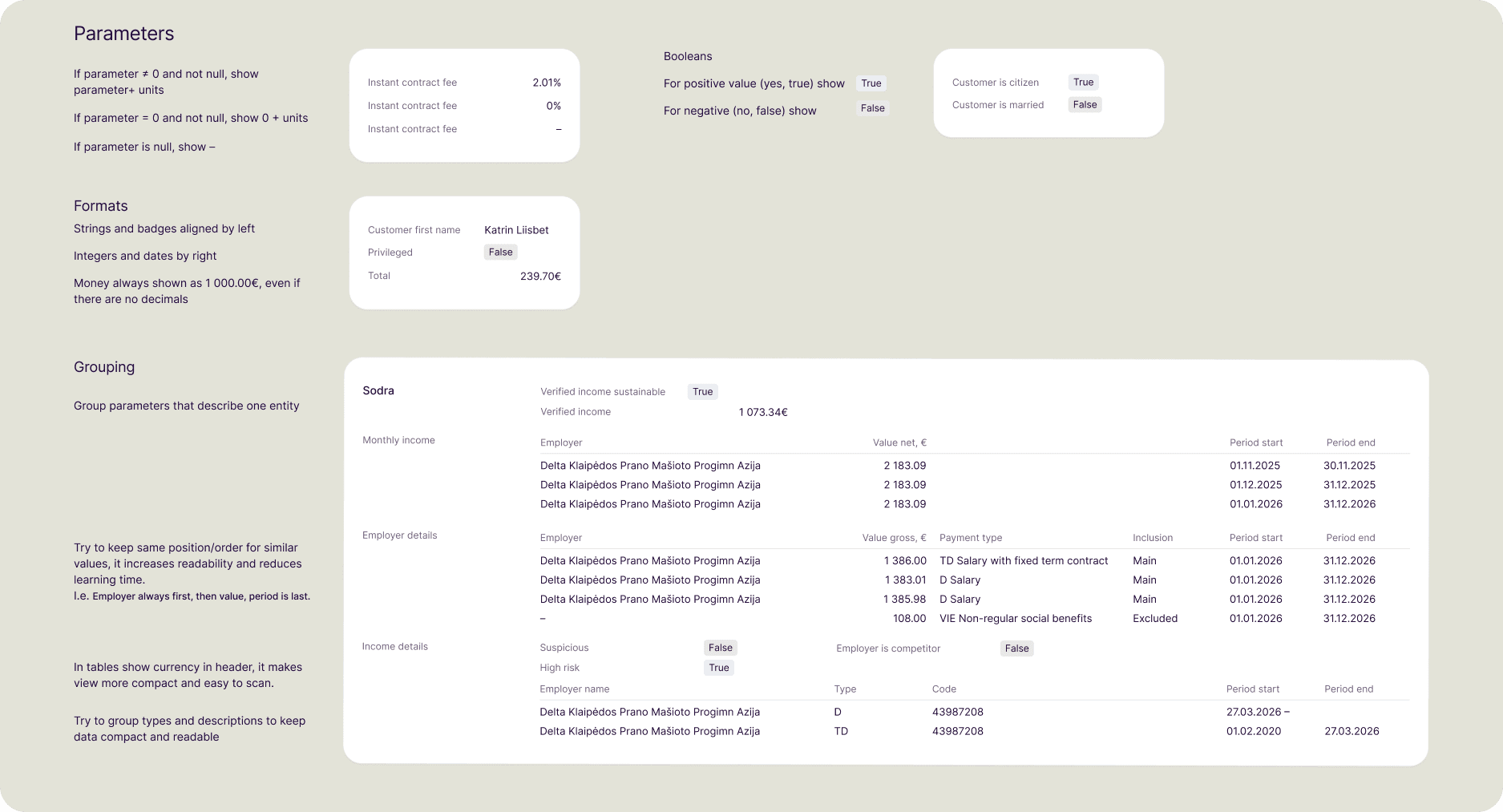
Compact yet concise
One of the main concerns users had was that some data might be hidden after the redesign, even though every detail can be important for a full review.
To keep things compact and tidy, users can hide empty fields and collapse register groups. The system remembers these choices, but users can show empty values again whenever they need to.

